|
User-Simulation Interface Review |


 |
User-Simulation Interface Review - A
usability inspection of a simulation based training system is guided by
general usability heuristics interpreted in the context of training
simulation systems. The inspector will review the storyboards either at
his/her own facility or at the simulation developer�s site against a set
of usability heuristic guidelines defined specifically for evaluating
training simulation designs. Using a standard template, the inspector
will identify errors or concerns and suggest potential modifications to
facilitate design conformity with usability heuristics.
"Usability measures the quality of a user's
experience when interacting with a product or system-whether a Web site,
a software application, mobile technology, or any user-operated device"
(http://www.usability.gov/basics/index.html).
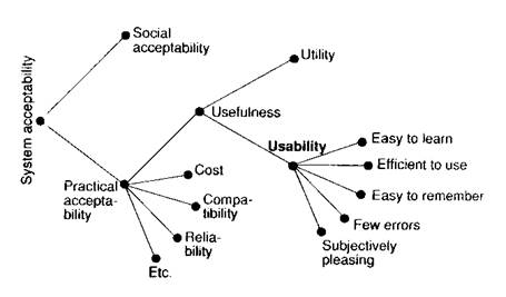
As shown in Nielsen's (1993) overview of system
attributes that contribute to acceptability below, usability is a combination of factors including:
Ease of learning
- How fast can a user who has never seen the user interface before learn
it sufficiently well to accomplish basic tasks?
Efficiency of use
- Once an experienced user has learned to use the system, how fast can
he or she accomplish tasks?
Memorability
- If a user has used the system before, can he or she remember enough to
use it effectively the next time or does the user have to start over
again learning everything?
Error frequency and severity
- How often do users make errors while using the system, how serious are
these errors, and how do users recover from these errors?
Subjective satisfaction
- How much does the user like using the system?
This figure also shows that usability does not
itself measure utility (or value of the
functionality provided), although both usability and utility are
generally considered to contribute to how useful a system is.

Nielsen (1993) A Model of the Attributes of System Acceptability
Nielsen originally developed a set of heuristics
for heuristic evaluation in collaboration with Rolf Molich in 1990 (Molich
and Nielsen 1990; Nielsen and Molich 1990). He later refined the
heuristics based on a factor analysis of 249 usability problems (Nielsen
1994a) to derive
a set of ten heuristics with maximum explanatory power (Nielsen
1994b). These heuristics are shown in the table below, but they
have been adapted for application to simulation based training contexts
and particularly virtual reality based training and manikin based
training.
|
Heuristic Guideline |
Description for Simulation Based Training Contexts |
Virtual Reality Based Training |
Manikin Based Training |
|
System
status visibility |
Simulation
system state should be transparent to the user at all
times. |
The simulation mode (e.g. demo mode, normal mode, role mode,
assessment mode, paused, or off) as well as the �state� of
the simulated world should be transparent. |
When
equipment is attached to a manikin it should be obvious if
that equipment is not working or turned on. |
|
System -
real world mapping |
It is best
to support natural perceptions (all modalities - visual,
audio, haptic, etc.) and to support natural actions in the
simulation environment. |
Perceptual
fidelity and support for "natural" action in the virtual
environment are important to represent the physical world
accurately. Language should also be realistic. |
The manikin
should be as realistic as possible, but when it is a partial
representation it should be made clear what won't be
authentic. |
|
User control
and freedom |
The user
should feel he/she is in control of the simulated
environment and, to the extent permitted by the training
control, free to explore/interact with the system.
|
The user
should be able to explore different information/views that
is/are available as long as there is no interference with
the pedagogical approach. |
Trainees
shouldn't be forced into a particular sequence of actions if
flexibility in the real world would exist. |
|
Consistency
and standards |
The user interface and basic system operations should be
consistent so that users benefit from learning conventions
within a particular system. Additionally, simulation based
training environment conventions across systems should be
applied. |
For instance, in the user interface language use should be
consistent, the location of options/information should be
consistent and typical interface commands should be used
(e.g. to direct movement) |
Interacting
with the manikin and any attached equipment should be as
similar as possible when going from one system to another. |
|
Error
prevention |
Interfaces
to the simulation based training should be designed
specifically to decrease the potential for occurrence of
slips and mistake. This is important in it�s own right for
general usability, but additionally assessed user
performance in the training environment should be a
reflection of the domain knowledge and skills demonstrated
and not influenced by a user interface that itself means it
is too easy to make a slip or mistake. |
For
instance, unnecessary ambiguity in language should be
avoided. Context sensitive disabling of options that will
do nothing, only lead to errors, or cause confusion helps.
Undo options where pedagogically acceptable can help. A
good help system for the actual user interface can help too. |
Users
shouldn't have to worry about the limitations of the manikin
or equipment and the potential for an unnatural response to
stop completion of a task during their performance. When a
"system" error does occur the trainee shouldn't be blamed
for it and should have an opportunity to "go back" and
repeat what was performed. |
|
Minimize
memory load |
Interfaces
should support recognition rather than recall, so that the
user can focus on performing in the simulated environment
and not on how to use the interface to that environment.
|
For
instance, making it easy to get to a drop down list reminder
of actions that can be taken rather than having to remember
an arbitrarily mapped set of keystrokes to command options. |
Things the
user has to remember that would not be necessary in the real
world should be minimized. |
|
Flexibility
and efficiency of use |
Make user
interfaces as customizable and flexible as possible.
Efficiency in any necessary �unnatural� interactions is
important, so that the user can focus on interacting with a
perceived natural world. |
The number
of keystrokes to give a command when using a keyboard should
generally be minimized. |
If there is
more than one way to perform a procedure with a manikin and
that is acceptable in the training context the user
shouldn't be constrained. |
|
Aesthetic
and minimalist design |
Often the
simplest and most minimal design options are often the best
for ensuring usability. The cognitive work involved in
using the simulation based training environment that is
required as system �overhead� and which wouldn�t exist in
the real-world should be minimized. |
The
interface should only display what is needed and the layout
should use whitespace and regions to aid readability and
grouping what is related together. |
Distractions
in the manikin or attached equipment that serve no training
purpose and which interfere with the user focusing on the
task being trained should be avoided. |
The MST-READI methodology includes procedures for
conducting the User Simulation Interface Review.
References
http://www.useit.com/papers/heuristic/heuristic_list.html
Molich, R., and Nielsen, J. (1990). Improving a human-computer dialogue,
Communications of the ACM
33,
3 (March), 338-348.
Nielsen, J., and Molich, R. (1990). Heuristic evaluation of user
interfaces,
Proc. ACM CHI'90 Conf.
(Seattle, WA, 1-5 April), 249-256.
Nielsen, J. (1994a). Enhancing the explanatory power of usability
heuristics.
Proc. ACM CHI'94 Conf.
(Boston, MA, April 24-28), 152-158.
Nielsen, J. (1994b). Heuristic evaluation. In Nielsen, J., and Mack, R.L.
(Eds.),
Usability Inspection Methods,
John Wiley & Sons, New York, NY. |

